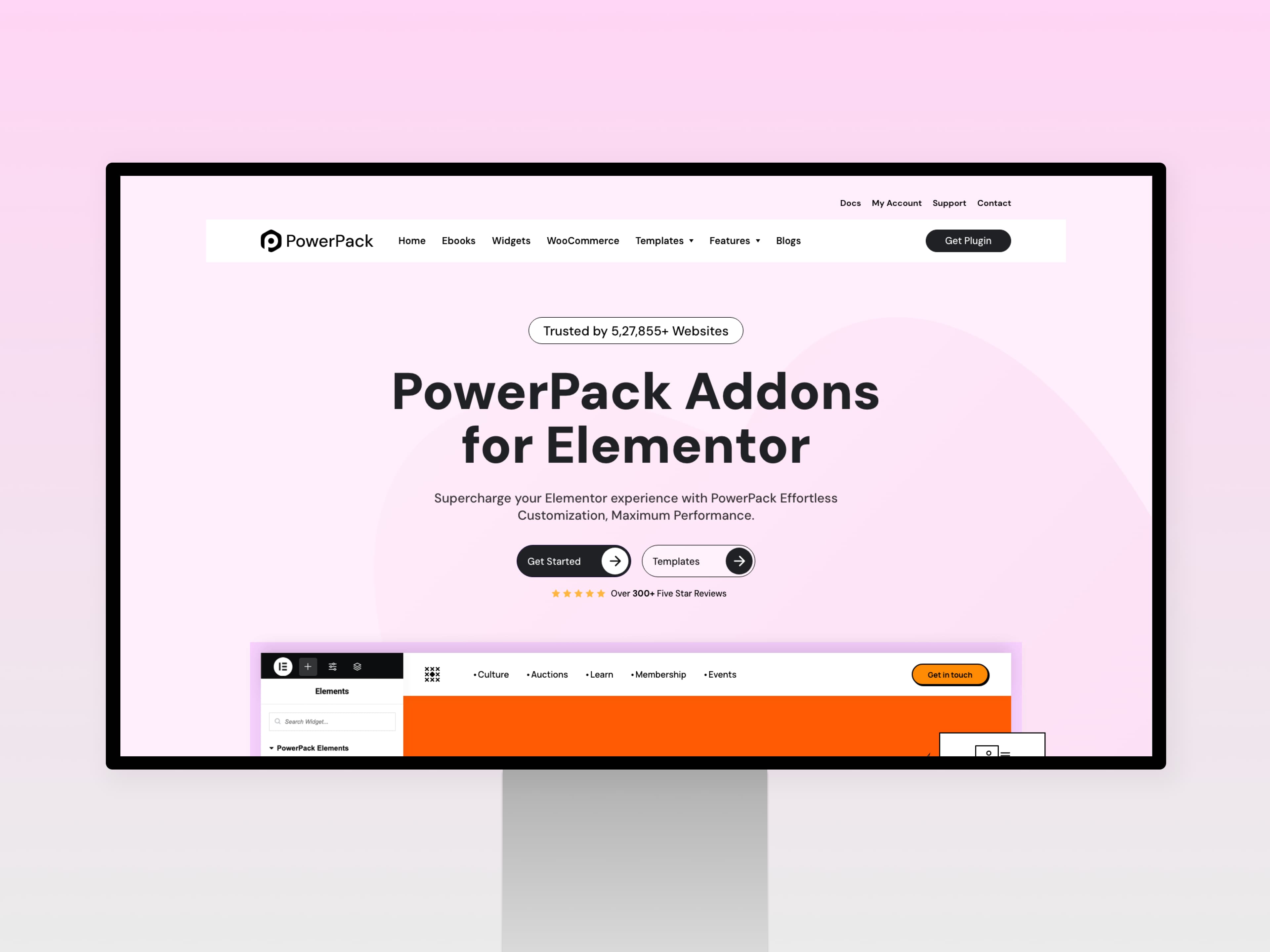
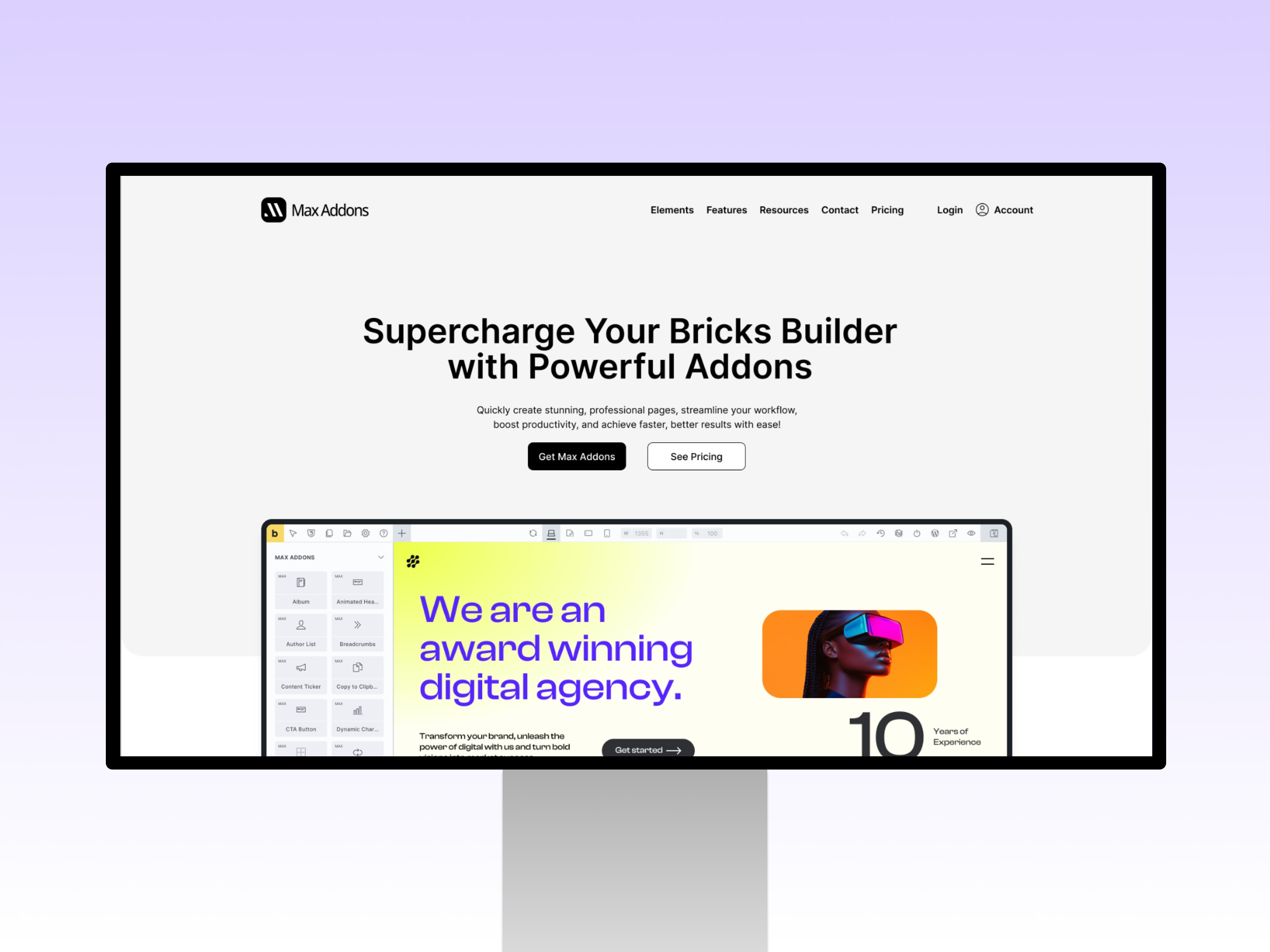
ChallengeMaking a powerful Elementor plugin feel simple to use.
As PowerPack expanded across more widgets, settings, and customization options, the experience needed to stay easy to understand. The core challenge was reducing interface inconsistency without limiting the flexibility that Elementor users expect.
SolutionBuild one visual language instead of isolated interfaces.
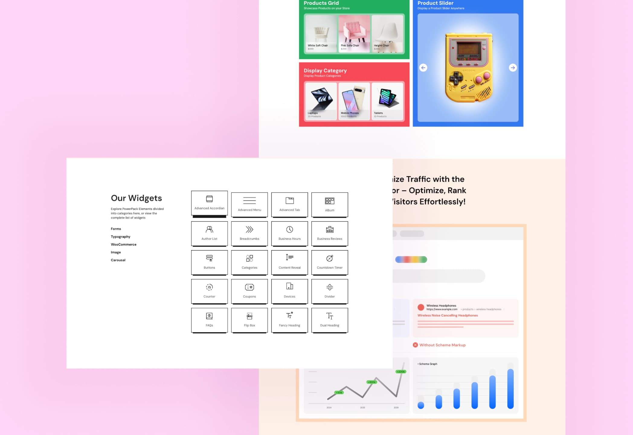
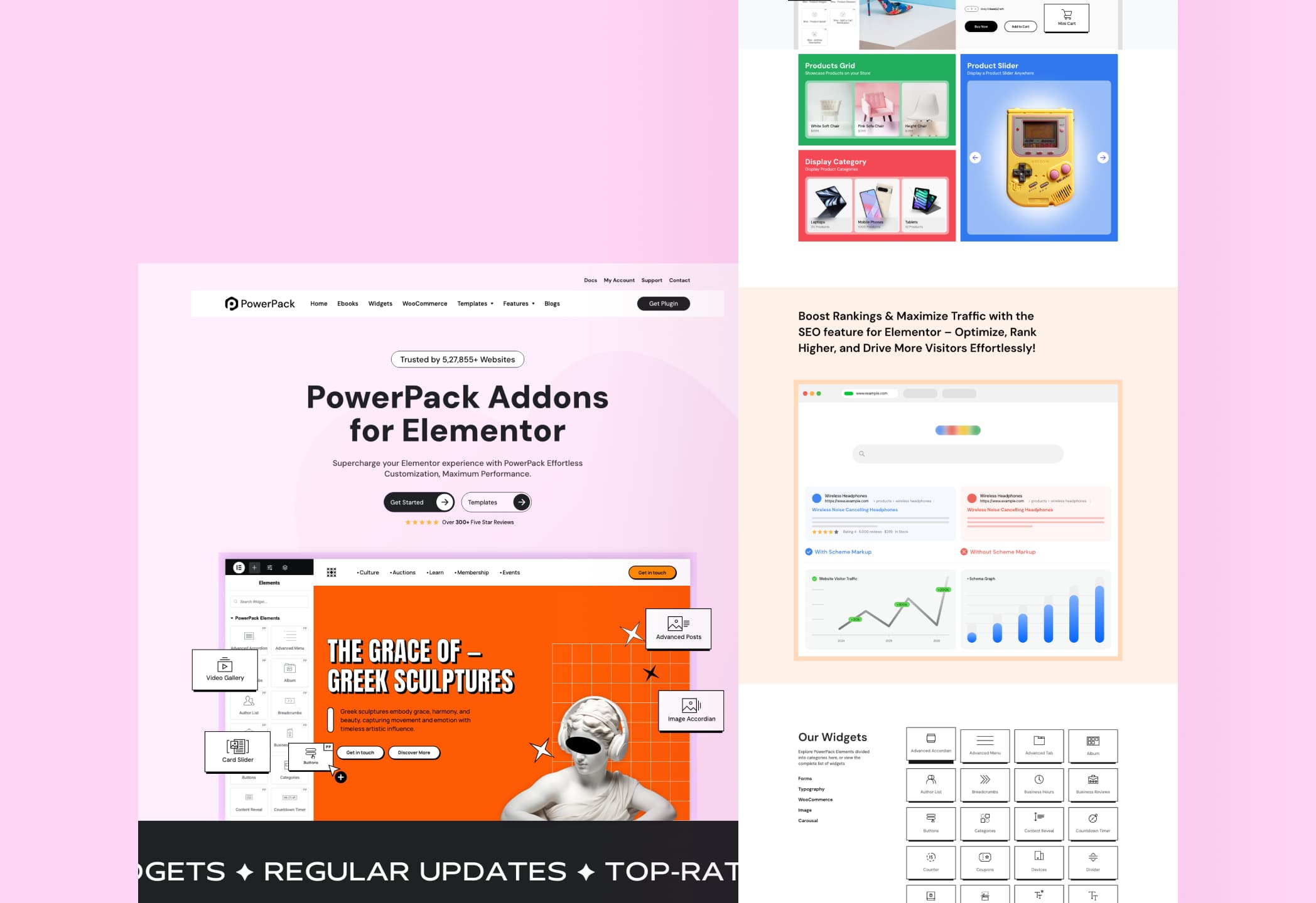
I approached repeated controls, states, and interaction patterns as one connected system instead of designing each interface in isolation. That meant simplifying hierarchy, standardising reusable components, and making common actions more predictable across the product.
DesignProduct thinking with implementation in mind.
The UI was designed with Elementor behaviour, development constraints, responsive states, and long-term maintainability in mind. Visual polish mattered, but the bigger goal was a product system that designers and developers could work with consistently.